Creating effectiveFacebook adsis a skill that all ecommerce entrepreneurs eventually need to learn. Whilefree marketing ideascan help you get your first few sales, top online stores all invest in advertising to ensure a skyrocketed growth. The truth is, creating awinning Facebook ads formulaisn’t as easy as you’d think. This article will show you Facebook ad examples you can use as inspiration for your next campaign.
Post Contents
- The Best Facebook Ad Examples in 2020
- #1. Brilliant Earth
- #2. My Top Kickstarter Projects
- #3. Longchamp
- #4. Me Undies
- #5. Meowingtons – Sample Facebook Ads
- #6. Pat Pat
- #7. The Night Sky
- #8. Luxy Hair
- #9. Royal Albert
- #10. Sephora
- #11. So Aesthetic
- #12. Storets
- #13. Suzy Shier
- #14. Zaful/RoseGal
- #15. Chanel
- #16. Bombas
- 17. WANDRD
- 18. LIV Watches
- 19. HearBloom
- 20.BlendJet
- Conclusion
- Want to Learn More?


The Best Facebook Ad Examples in 2020
#1. Brilliant Earth

If you’re selling jewelry or in this case engagement rings, carousel ads work well. Most women have different tastes and carousel ads allow you to show different styles and colors to appeal to a wider audience. I’ve personally seen this ad in my newsfeed, about every single day. After seeing it for what felt like the 100th time over the course of a year, I finally browsed the website to send my partner a picture of an engagement ring style I’d really like so this is one of those Facebook ad examples that actually work. When it comes to the ad copy, it’s simply asking customers to shop trends. But truth is, for this type of product the audience is more focused on the pictures they’re viewing rather than the copy they’re reading. This could be a successful Facebook ad as there’s some engagement on it with over 200 likes and 13 comments. Plus, I know from seeing this ad all year that they’ve experimented with different pictures so it’s definitely not their only ad. Noticeably, they always stick to carousel ads. If people are clicking on the ads, it’s a good sign that they’re great Facebook ad examples.
#2. My Top Kickstarter Projects

This made our list of Facebook ad examples because it focuses on the impulse buy. When I saw this ad I originally thought it was an article and clicked on it. Something that pops in this ad is that certain words are written in ALL CAPS. Though some may not like all caps text, it really does capture attention. And the truth is, if you’re presenting the right product or offer, people will appreciate the unique appearance. The keywords that pop well in this ad is ‘CRAZY comfortable.’ Comfort is something many look for in a shoe so it’s an important keyword and crazy adds an emphasis on how comfortable it really is. And the emphasis on ‘elegant’ and ‘luxurious’ make you feel like you can be comfortable even when dressing up, which is rare, especially in women’s shoes. The picture is also interesting because it breaks down the components of the shoe. This is often found in ads for running shoes but not as common for women’s shoes like heels or in this case flats. Overall, the unique image and the all caps convinced me to stop scrolling and click.
#3. Longchamp

If you’re looking for Facebook video ad examples, then you won’t be disappointed by this Longchamp ad. The ad showcases a model spinning around showing her clothes and handbag in the shot. The copy is simple. It let’s potential customers know there’s a new collection for women, hence the word ‘Mademoiselle.’ This effective Facebook ad has over 940 likes, 16 comments and 68 shares. Noticeably, the ad has had over 213k views which is a pretty high reach. When I saw the ad, I basically watched it on loop for about two minutes and didn’t even realize it. I’m pretty sure this was a retargeting ad. And I also saw this on my Instagram feed which is another great platform for video ads.
#4. Me Undies

Creative Facebook ad examples like this Me Undies one stand out in a crowded marketplace. While most marketers don’t recommend a blue photo on Facebook’s blue and white platform, this dark blue image definitely stands out. While it won’t work with every niche, glow in the dark products like this one are the exception. The product is more of an impulse buy rather than a search based product making it a great item to promote on Facebook. The picture clearly shows a glow in the dark product and the dark image makes it more apparent that that’s what they’re selling. The copy also emphasizes this point with ‘It’s Lights Out!’ The engagement on the ad shows that this is a unique product, especially since nearly 7k people liked the post and nearly 700 people shared it. And with over 1k comments, you can likely expect there to be some comments where people are tagging their friends. Such Facebook ad examples remind entrepreneurs to be different to stand out on a crowded marketplace and to focus on promoting impulse buy products.
#5. Meowingtons – Sample Facebook Ads

Many dropshippers have found success creatingFacebook ad designin the same style as this Meowingtons ad. I’ve definitely tried this on my own online store and noticed it works well. First, you have a discount based offer which can help entice people who are interested in buying the product. I’ve tried 50% discount offers and those also work really well. The discount code is visible in the title allowing people to add it easily once they’ve found a product they love. Also, notice how the copy reads ‘ENTIRE SITE.’ Say you’re not interested in this specific product but you’re a fan of this online store, or you just love cats, you might still choose to browse around on the website anyway. Facebook ad examples like these are usually centered around holidays (Meowingtons’s ads were active on Labour Day), which is as good an excuse as any to host a sale. When it comes to creating copy for your online store, this is a good example of the types of information you should include. Just double check to make sure that your copy doesn’t get cut off or miss any key information.
#6. Pat Pat

This effective Facebook ad is the perfect combination of cute and colorful. If you’re a new parent, seeing pictures of cute babies can help lead you into an impulse buy. Plus, a baby in a cute animal onesie is pretty adorable, which makes the image quite attention grabbing. But even if you scroll past the picture, you’ll notice a pop of color with the multiple emojis used. From lollipops to explosions the emojis add an emphasis to the copy. And the copy? Well, it lets you know that you have a limited offer of up to 80% which sounds like quite the enticing deal. The limited time gives you that fear of missing out, which also helps encourage the impulse buy. Also, notice how they describe the outfits: ‘soft & cute’ which can also be used to describe babies. Overall, all the components from images to emojis to copy all work together to create one of the most effective Facebook ad examples you’ll find in our list.
#7. The Night Sky

This is a video ad for a star map. The copy mentions details of when you would likely want to have the product, such as the birth of a child, engagement, wedding or a special moment in time. It’s a quirky product which makes it perfect for capturing the impulse buy. That could be why over 3k people have liked the post and over 600k people have viewed the ad. Once again, we see emojis being used in the ad which gives it a pop of color within the text to help draw more eyes to the copy. You’ll notice that the link says ‘A Gift to Remember’ with a heart emoji beside it. Since the earlier copy mentions special occasions, it helps forge the connection between the special event and gift. Hence, if you’re targeting new moms or people heading to an engagement party, you can take inspiration from Facebook ad examples like this one.
#8. Luxy Hair

This Luxy Hair ad is the best Facebook carousel ads example I came across during my research. As they sell to women they often show content with beautiful women to help their audience imagine how much better they’ll look with their hair extensions. You’ll notice how the copy even mentions the problem they solve: ‘add instant length and volume.’ A person with short or thin hair is likely theirtarget marketas they want a more enhanced look. Noticeably, Pia Muehlenbeck is the star of the ad and if you’ve ever seen her Instagram account you’d know she has 2 million followers. When replicating Facebook ad examples featuring influencers like Piat, you might not have the budget to get a high-profile individual on board, however, you could always leverage the active following ofmicro-influencers.
#9. Royal Albert

If you’ve ever read anything I’ve written onretargeting ads, you’ll know how effective they are for converting the audience. I regularly browse Royal Albert’s website and this was a retargeting ad I got after looking at their products. What I love about this side bar ad is that it offers an incentive to purchase by offering a freebie with ‘Buy 3, Get 1 Free.’ The copy below the headline and site URL shows that they likely understand their audience as they say ‘Be the perfect host with Royal Albert Dinnerware.’ It makes it apparent that their customers buy their products to host nice events. And for the record, I have hosted tea parties at my house and so even without having much data on me, Royal Albert pretty much nailed it with this Facebook ad.
#10. Sephora

我喜欢Facebook广告例子以年代ephora is how much the brand experiments. I always get Sephora ads but they’re never the same. They constantly show different products, have different offers, unique copy and more. Look at how the products are laid out on the graphics. They position the products at certain angles or create a visually stimulating graphic. The foundation or lip color is spread so you can better see what it looks like, but it also helps the visual look appealing. They don’t just take plain product photos, they add design elements to help make it pop. One thing to notice is that the domain is in all caps to help add emphasis. These may be retargeting ads as I regularly shop on their website. If they are, the all caps link makes sense as I’d already be familiar with the brand and it gives it an added emphasis.
#11. So Aesthetic

I usually don’t share Facebook ad examples featuring clothing without models but this one popped with the simple addition of the purple background. If you don’t have the budget to take model photos or if your manufacturer only supplies pictures without models, feel free to add a colored background to make the picture pop against a plain white background. It’s simple and easy to do, but the contrast can help draw more eyes to your ad to entice the click through. Also, when it comes to copy, be sure to double-check that none of your ad text gets cut off before publishing it.
#12. Storets

旋转木马广告倾向于伟大的时尚在线工作retailers. Storets created an ad to show off a collection of pink colored apparel. If you divide your apparel by color, you can create a retargeting ad for people who browse by color and create a collection based on that color. When it comes to ads, you don’t need to show off a specific outfit. You can create ads based on color, themes such as nautical or material such as lace. The carousel ads work well in this case, especially if you’ve really narrowed in on your target, as it allows them to view a few products that might suit their style. Notice how vibrant the first image is. It’s done intentionally to attract a people’s eyes to the ad and get them to stop scrolling down. You’ll also notice that they too use emojis in the copy and even included a hashtag that you can view or use to post your own pictures.
#13. Suzy Shier

This classifies as one of the best Facebook ad examples due to the strategy it follows content marketing. While most retailers create ads that direct customers to a product page, you can also direct your traffic to content or a blog post. These types of ads can be helpful at engaging and converting information-hungry prospects. Not everyone is ready the first time they see a product. However, content let’s people learn something new. You can also retarget a blog reader and have a much lower ad cost. When I retargeted my blog readers, I had a 9x ROI when they bought my products. It was one of the cheapest and yet most profitable ads I’d ever created.
#14. Zaful/RoseGal

Zaful and RoseGal are two online retailers who change their ads regularly. They both create ads in a similar style. Notice how they both use three columns of products. One shows a front and backside view of a top, while the other shows the color variations shoppers can choose from. Their copy is quite similar too. Both mention a percentage discount to help entice a budget conscious consumer. And both use symbols. Zaful uses brackets to emphasize their free shipping. And RoseGal creates hearts next to the question ‘What Color Do You Like?’
#15. Chanel

This video Facebook Ads example has over 173K views with hundreds of likes. The video was also used as a commercial and features celebrity Keira Knightley in their ad. While you might not have a budget to hire a celebrity for your ad, you can choose to reach out to asmaller scale influencerto help you create a video ad. In addition, this video ad was also used for television commercials and YouTube, so don’t be afraid to repurpose your content. You can use your video ad for yourproduct page, YouTube channel or even add it to a blog post. The content you create for your ads doesn’t need to be limited to the ad. The online stores featured in our Facebook ad examples have probably repurposed some of their video and text-based content on their other digital properties.
#16. Bombas

Bombas is all about introducing its socks to first-time shoppers and inviting them to claim a 20% discount. The carousel ad uses a static slideshow in the first image and image-based value propositions in the rest. Each image also contains an enticing copy like “SEAMLESS TOE, NO MORE ANNOYING TOE SEAMS” while conveying Bombas’ CSR (Corporate Social Responsibility) of addressing sock shortages to those in need. When it comes to ad copy, the apparel store puts emphasis on the discount and leaves a code that shoppers can use on the checkout page. Replicating Facebook ad examples like these can help reduce shopping cart abandonment, as the discount code will remind people they are getting a good deal.
17. WANDRD

This is one of those rare Facebook ad examples that show a single product in different settings. Watch the bag as the environment around it switches various times to depict that it’s ideal for every lifestyle. This can be awinning Facebook adas it has generated over 200 reactions and 6 comments. The copy is where the ad really comes to life, with statements “the minimalist travel backpack enables you to live in the moment and never miss out on an opportunity” present to help people imagine the benefits of traveling with a WANDRD bag.
18. LIV Watches
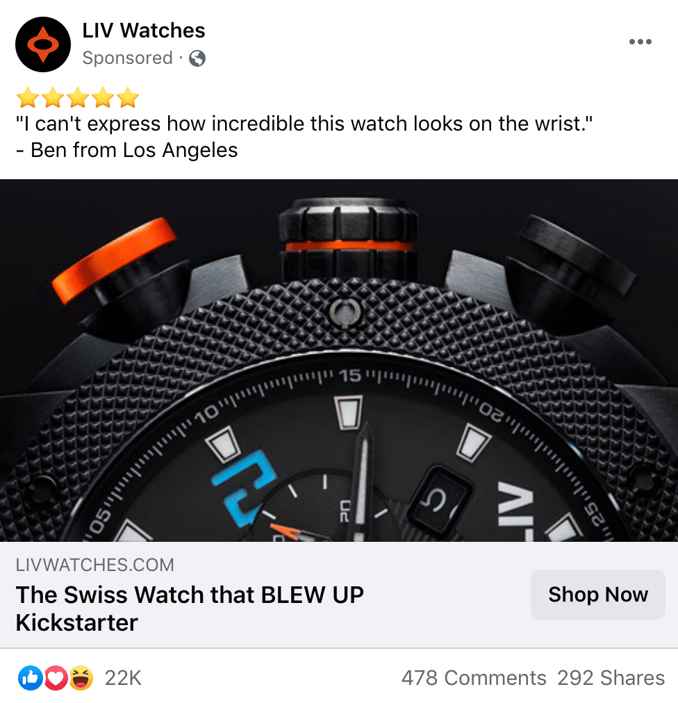
You’ve probably come across an ad or two trying to highlight the benefits and design of a Swiss watch. But you said, “Nah, I don’t think it actually looks that good in real life.” Perhaps your opinion would be different if the Facebook ad hadsocial proofto back up the claim. The next ad on our Facebook ads example list does. LIV Watches uses a customer testimonial in the ad copy while reminding people that its product is a hit on Kickstarter. The Shop Now call-to-action also encourages people to act immediately by visiting the company’s website. From the headline to the image to the copy, every element in the ad is focused on generating conversions.
19. HearBloom
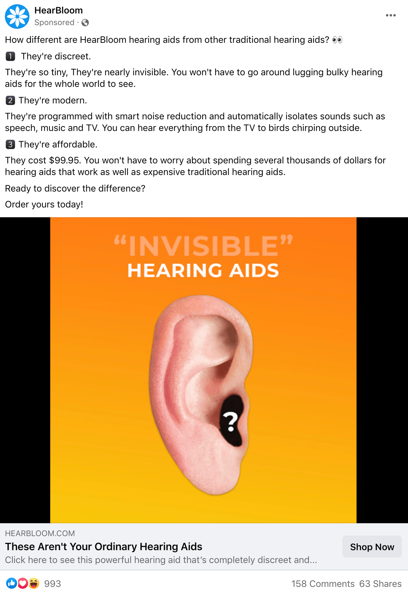
This is another Facebook ads example that’s strong on the copy. It uses short sentences, emoji-based bullets, and witty vocabulary to explain the differences between ordinary and visible hearing aids. The headline also reinforces the USP that the product is different from what’s usually sold in supermarkets and airports. HearBloom also uses a simple image of an ear featuring a question mark on a yellowish background that makes it simple to understand. The ad has received over 900 reactions and 158 comments, meaning that it’s a hit with Facebook users.
20.BlendJet
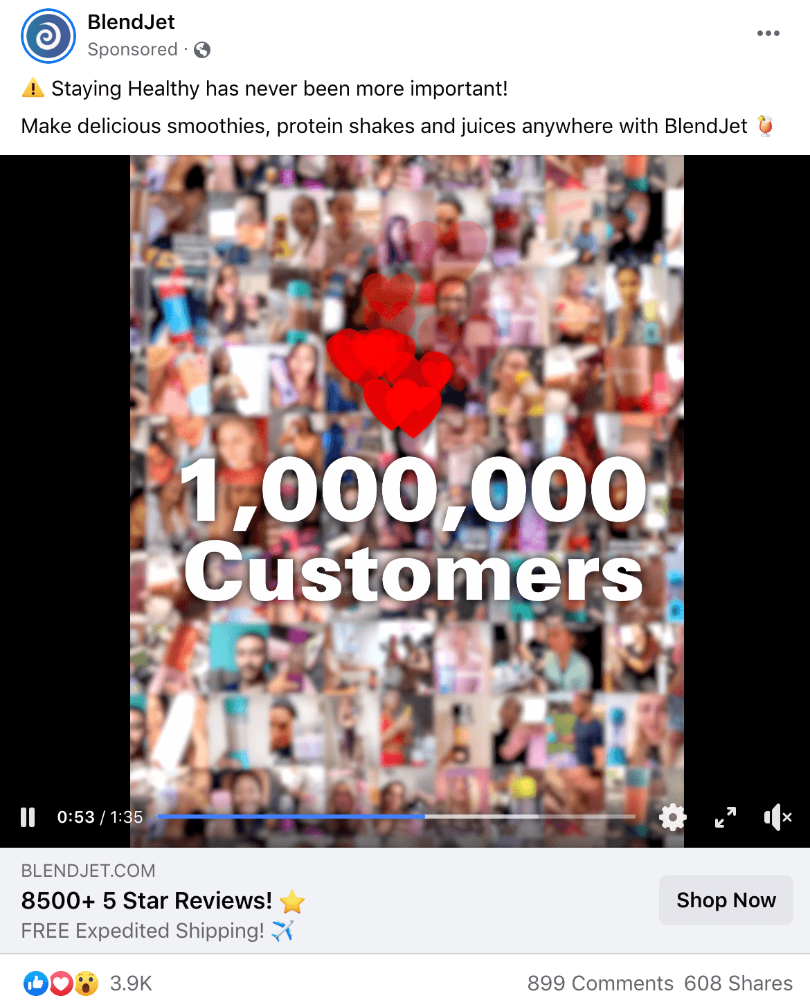
The last on our list of Facebook ad examples is BlendJet’s product video ad. The majority of the video is a demonstration of the product in action, but the company also makes sure to cite the number of customers who’ve ordered its blender. When it comes to ad copy, BlendJet utilizessocial proofto engage and convert customers. And if someone still isn’t convinced by the blender’s 8500+ 5-star ratings, the brand offers free expedited shipping at no cost. All of these elements are surely working because the ad has managed to generate almost 4000 reactions and 900 comments. It’s also widely shared, which means people are spreading the word about the product in the ad.
Conclusion
These 20 Facebook Ads examples can help you better understand what type of ad format works best with your audience, what the focus of your ad should be such as copy versus image, and how to create effective Facebook ads as a whole. While you may be tempted to copy their ads in their entirety , the truth is, your store’s audience is likely different than the ones mentioned above. These Facebook Ads examples can be used as a guideline or a starting point when building your first few Facebook ads, but ultimately you’ll need to experiment to find out what resonates with your specific audience. Also, keep in mind that this article doesn’t mention the important of having a mindset that you’re notwasting money on Facebookortargeting这也将扮演一个重要的方式e in your success on Facebook.
Did these Facebook Ads examples help you better understand how to craft an effective ad? Let us know if you have any ad related questions in the comments!
