Tiffany & Co.is a great online store to use as inspiration for your first store. Their homepage uses a unique color combination of pink and seafoam green which helps differentiate themselves from other online jewelry retailers. Using images with a unique look can help separate your brand from others.
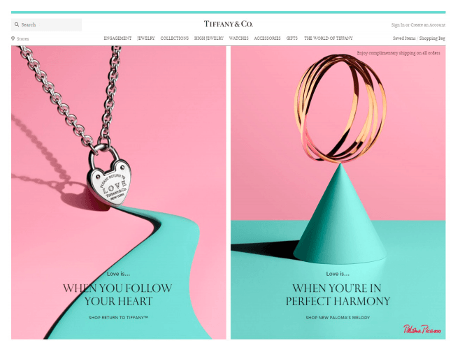
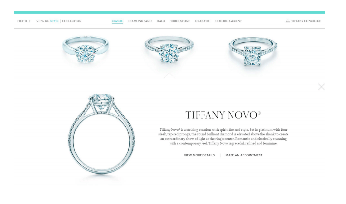
The product listing and product pages also have a clean, minimalist and seamless look.
当你点击一个产品照片in the listings, a product description pops up and you’re given the option to continue to the product page. Once on the product page, emphasis is on the product image with short and easy to read product details. The product picture shows the highest quality product first. Customers can reduce carat size for a more affordable piece of jewelry. Various product angles are also available to browse through. If a customer continues to scroll down, they’ll first be presented with an upsell. They can pair their engagement ring with a wedding band. It allows them to see which type of band best complements their engagement ring.
Notably, as engagement rings are high cost products, Tiffany & Co. offers financing options to their customers. If you plan on opening an online store with high cost items, you might also choose to offer financing options to your customers which would allow them to pay for the product cost in installments. However, you’d still need to pay your suppliers in advance.
